Design Systems have become an essential part of modern web and app design, offering a unified approach to design and user experience.
ATLAS is the Design System of Adjust. At the core of a well-structured Design System are reusable components, design-tokens, patterns and much more that not only enhance efficiency but also ensure consistency throughout a project. Our aim is to create a design system that can be used seamlessly across multiple teams and multiple Adjust products.
The Power of Reusable Components
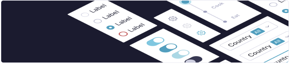
Reusable components, also known as UI components are the building blocks of a design system. These components encapsulate design and functionality, making it easy to replicate, maintain, and scale design elements across various parts of a product.
Here’s why they are so powerful:
Consistency: One of the primary advantages of reusable components is that they enforce consistency. When you use the same components throughout your project, you ensure that the design remains uniform. Consistency is key to a better user experience.
Efficiency: Reusable components save time and effort. Designers and developers don’t need to reinvent the wheel every time they want to create a button, a form input, or a navigation bar. Instead, they can reuse existing components, which speeds up the design and development process.
Scalability: Reusable components are essential for scalable design systems. As your project grows, you can easily add new components or enhance existing ones, making it adaptable to evolving requirements.
ComboBox , DatePicker, FitterButton, Icon and Table are some of the most used components in ATLAS.
Consistency Beyond Colors
At the heart of every effective Design System lies a versatile tool: Design Tokens.
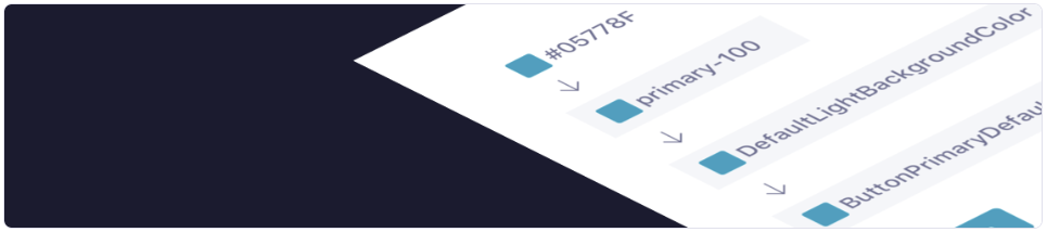
Design Tokens are the atomic units of a Design System. They encapsulate design decisions such as colors, typography, spacing, and more in a structured format. Tokens ensure a consistent and scalable UI across Adjust products.
Some Key Elements of Design Tokens:
Colors: Design Tokens define a color palette, ensuring that every hue, shade, and tone used in the interface is consistent. This consistency not only enhances aesthetics but also reinforces brand identity.
Typography: From font families to font weights and sizes, typography plays a vital role in user readability and interface aesthetics. Design Tokens encapsulate typographic choices, ensuring uniformity in text elements.
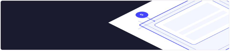
Spacing: Proper spacing is essential for a visually appealing and user-friendly interface. Design Tokens define consistent margins, paddings and grid systems, providing a structural foundation that maintains harmony in the layout of elements.
Shadow: Shadows create depth and hierarchy within a user interface. Design Tokens define elevation levels, ensuring that elements cast shadows consistently, enhancing the user’s perception of the interface’s spatial layout.
Guiding Users Through Intuitive Experiences
To streamline the Design Process we use patterns and templates across multiple Adjust Products.
Patterns are recurring solutions to common design problems. Whether it’s a navigation menu, a search bar, or a login form, patterns provide a consistent and intuitive user experience. By incorporating established patterns within the Design System, designers can guide users seamlessly, enhancing usability and reducing cognitive load.
Empty state, Page Header, Tile are some of the pattern components that are furnished by ATLAS Design System.
Templates provide predefined structures for common layout designs. These serve as starting points for designers, enabling them to focus on creativity and innovation rather than reinventing the wheel. Templates ensure consistency across different sections of an application or website, simplifying the design process and promoting a cohesive look and feel.
In Conclusion: The Power of Integration
A well-crafted Design System, with its components, design tokens, templates, and patterns, serves as a unifying force in the realm of user experience design and development. It streamlines collaboration, ensures consistency, and accelerates the design process.
In today’s fast-paced digital world, embracing the power of a Design System is not just a choice; it’s a necessity. It’s a commitment to delivering exceptional user experiences, fostering brand loyalty, and staying ahead in the competitive landscape. So, let your creativity soar within the structured confines of a robust Design System, and watch your user experiences transform into something truly extraordinary.